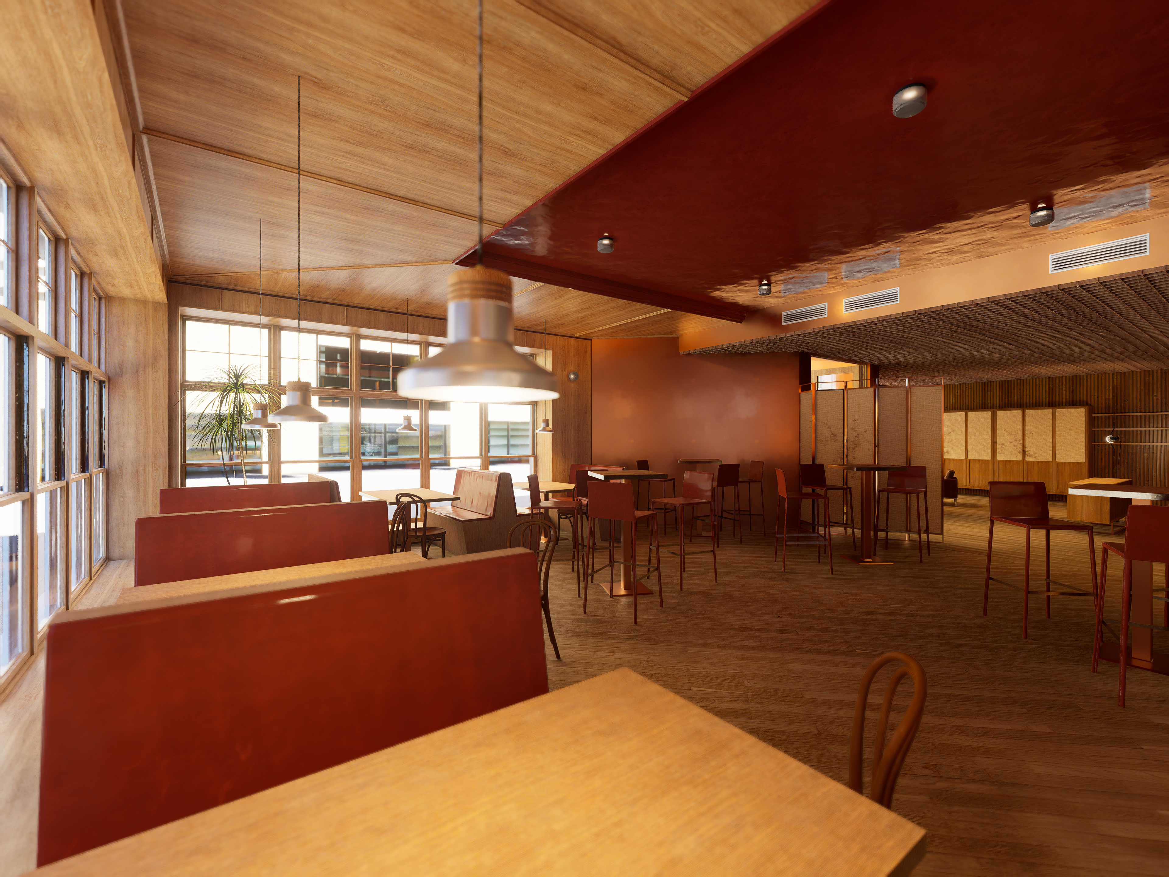
Cocktail bar dining space and floor
This was the final project of my third year at ESD. The goal was to create a complete restaurant from scratch, given only the location and the structural layout of the venue.
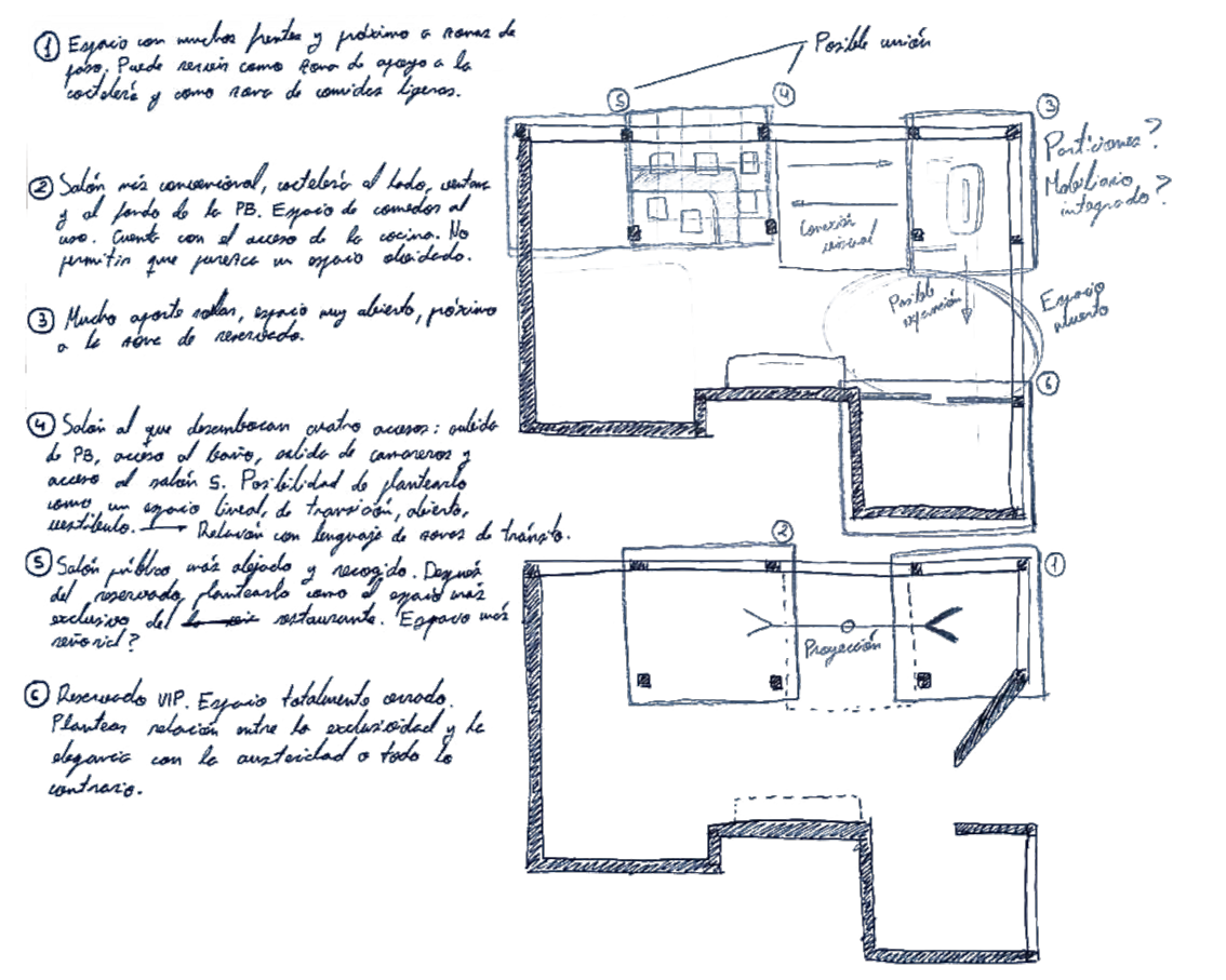
During the conceptualization phase, I relied on hand-drawn sketches and inspiration from existing projects around the world. Later, all the drafting was done in AutoCAD, the 3D modeling in SketchUp, the rendering in D5 Render, and the final presentation in InDesign.
(SPANISH)
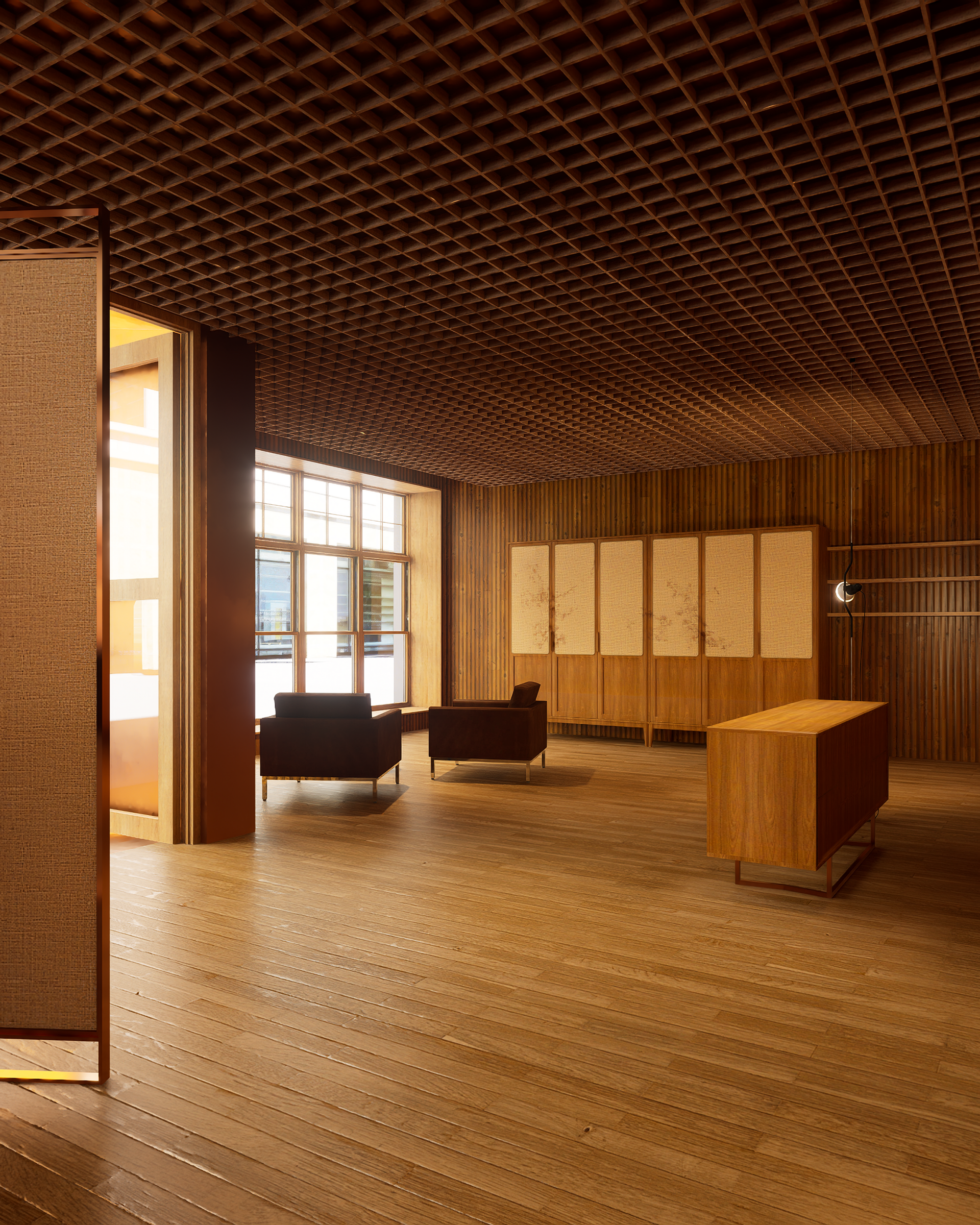
Foyer
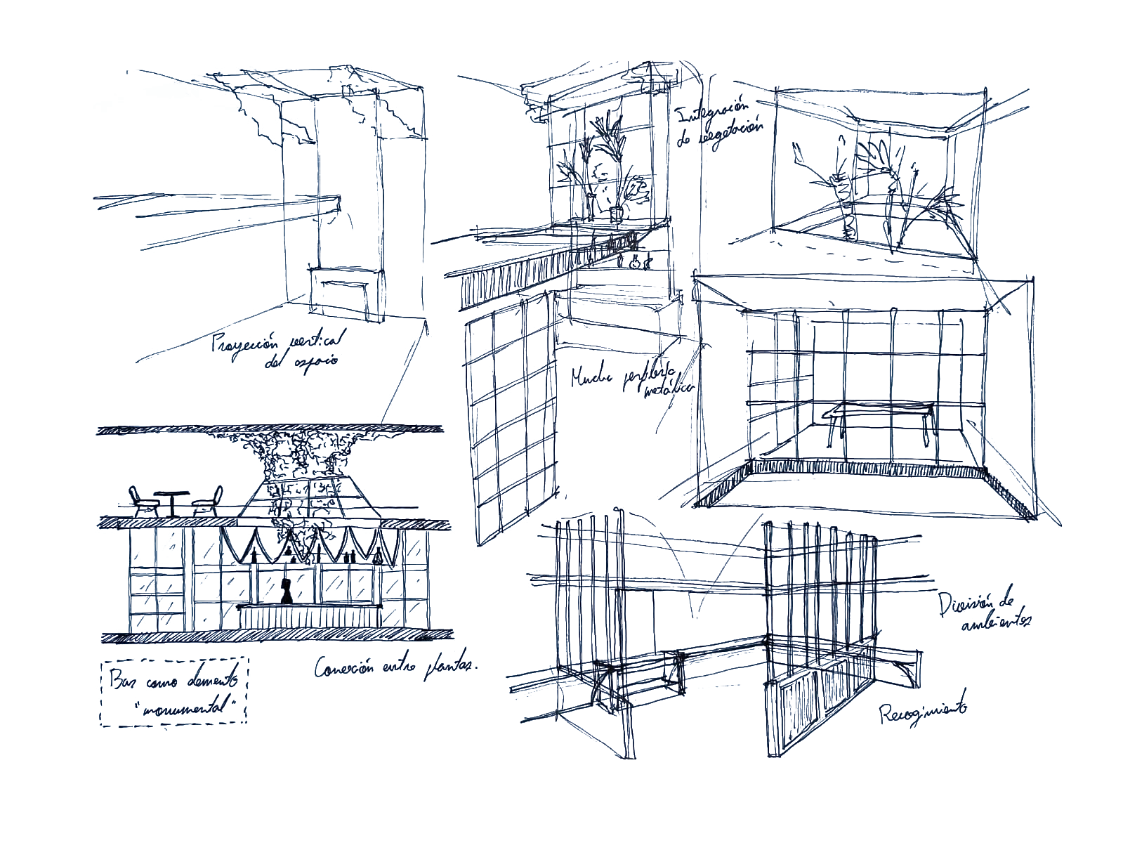
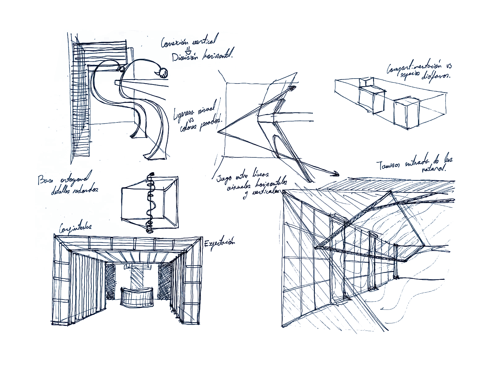
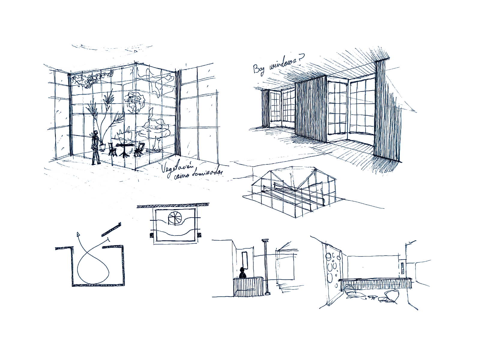
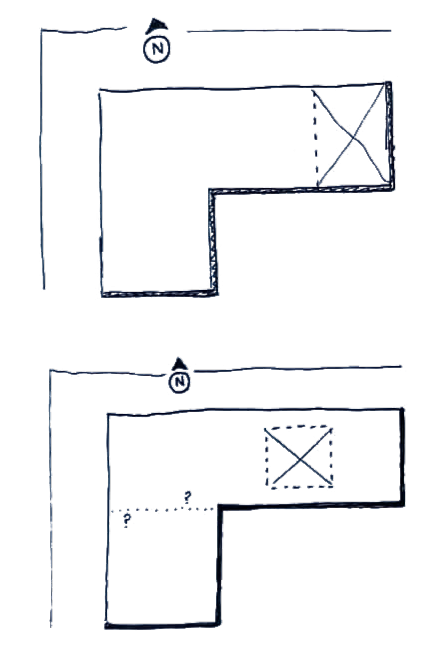
The ideation for this restaurant began even before knowing its layout or how its structural elements were distributed. The only information available to start with was that it was a corner property, that it spanned two levels (ground floor and first floor) with an opening connecting them, that the floor plan was L-shaped, and that its longer side faced north.
From the very beginning, the intention for this project was to create a simple restaurant, one that would make the most of the containing volume, not in terms of seating capacity, but rather by enhancing its architectural and spatial features. Reading Rafael Moneo’s words about El Reno restaurant in his article on Il Giardinetto was incredibly helpful in this regard. In this article, he discusses various strategies that can be applied when designing a dining space, and specifically says the following about El Reno:
“One could speak of an abstract definition of space, which, through the mastery and exhibition of a specific language, would effectively come to construct an atmosphere. [...]
Even at the risk of simplifying and reducing reality, I would say that the first of these proposals would require, above all, a method, and with it, the architect’s work becomes a process that ultimately provides an atmosphere. El Reno would fit within this way of thinking about architecture, where security and correctness in the mastery of a language would seem to be the most prized virtues.”
When Moneo speaks of 'language' in the interior design of this restaurant, he is referring to the set of visual elements and design choices that communicate a coherent idea, emotion, or identity for the space.
Moneo discusses other strategies that can be followed when designing a restaurant. However, while it is true that a clear language must structure the decisions in all of them, he draws a distinction between language as a project strategy and language as cohesion between elements.
Designing from language might seem to leave aside strategies such as 'narrative' or 'representation,' but it is quite the opposite. The narrative of a language-driven project lies in representing the existing architecture and enhancing the space within it, rather than hiding or masking it.
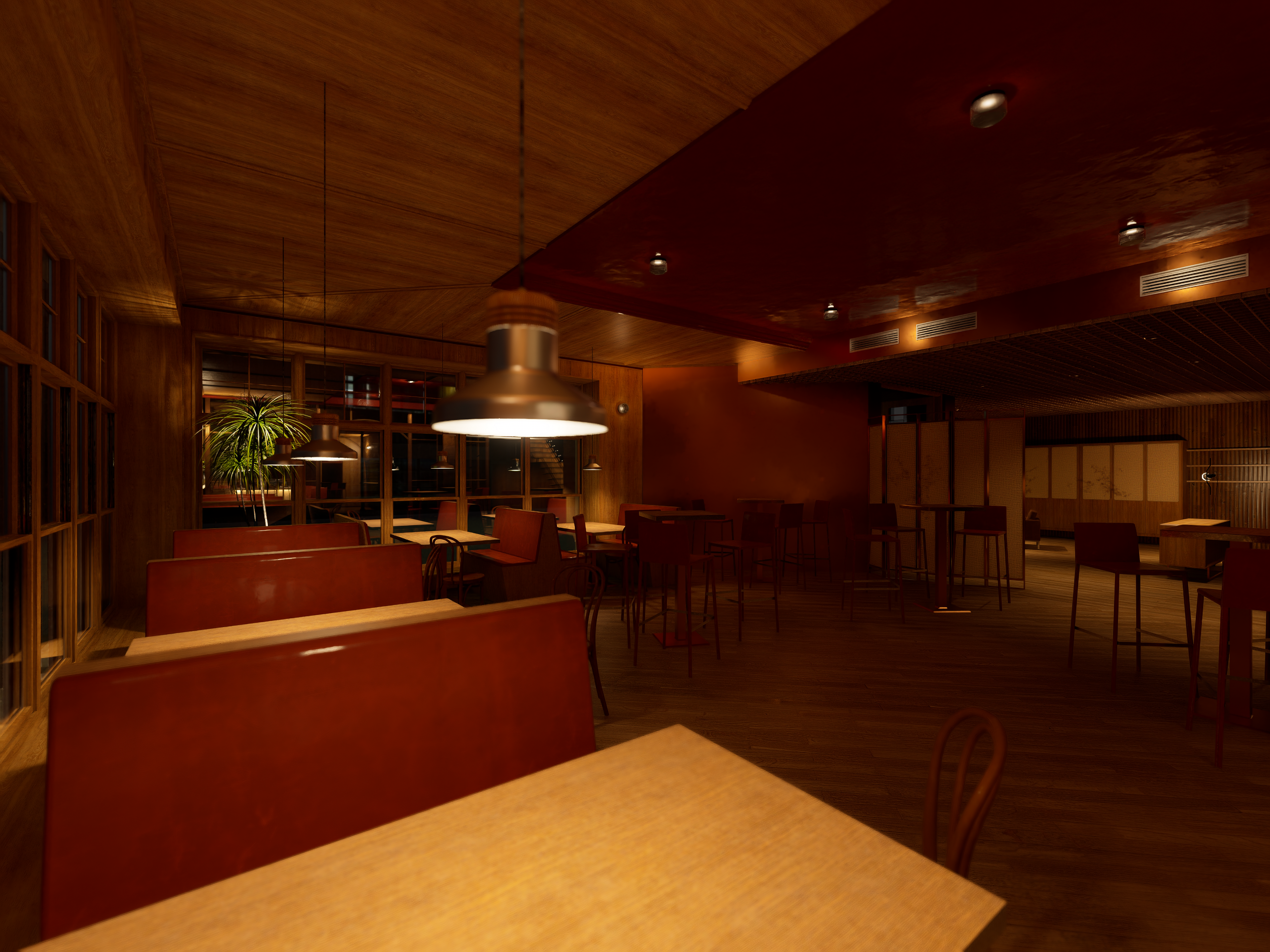
Cocktail bar dining space and floor
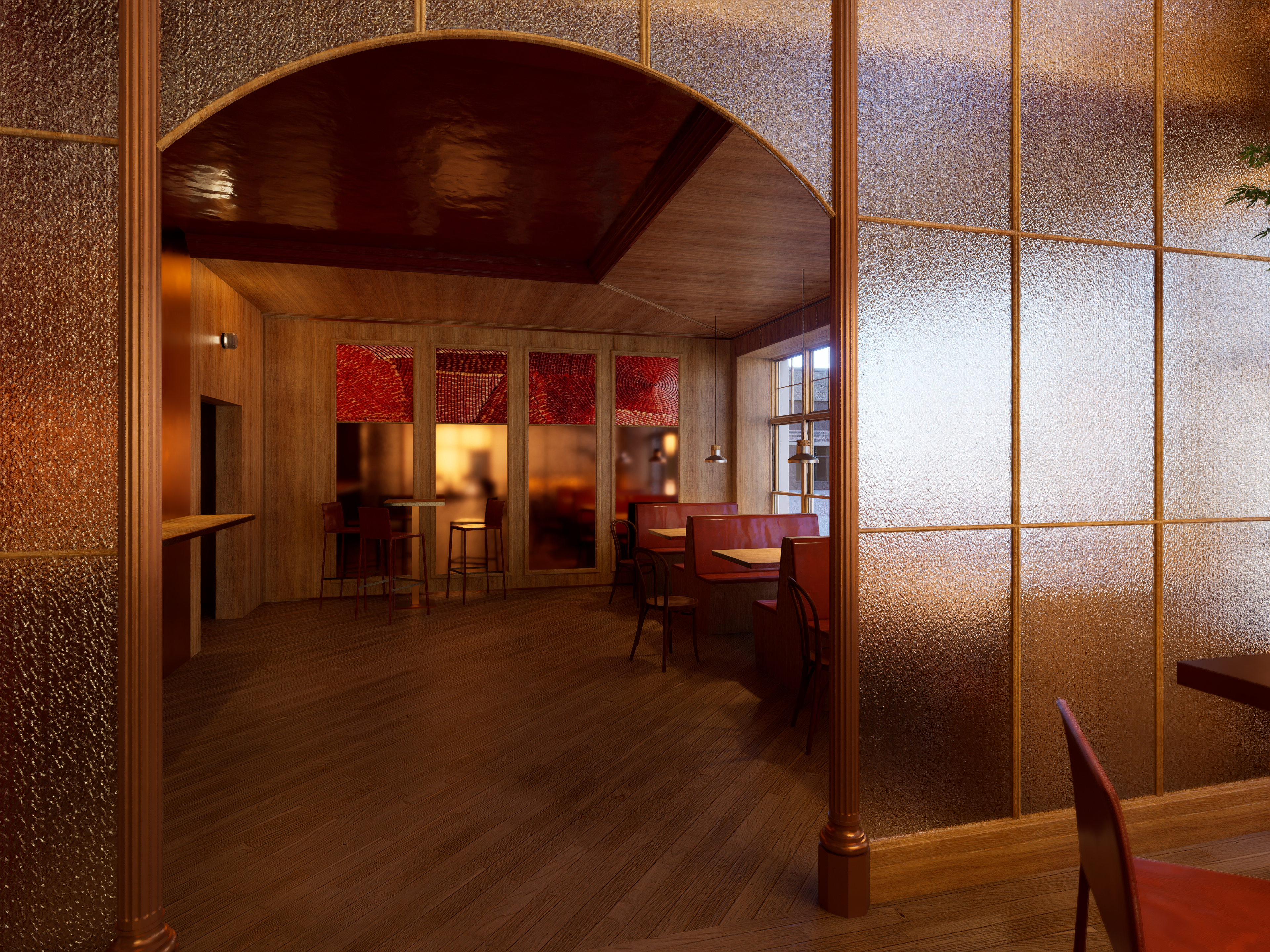
Cocktail bar dining space and floor
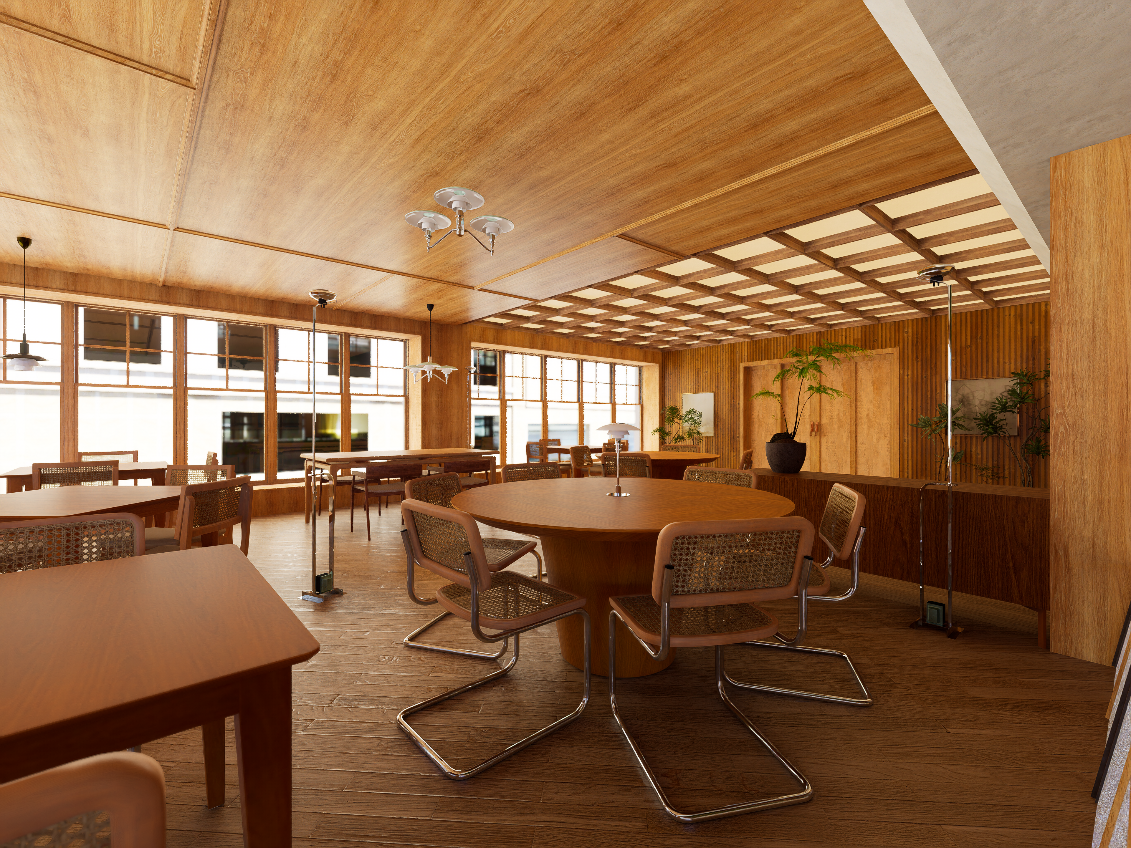
Restaurant dining space
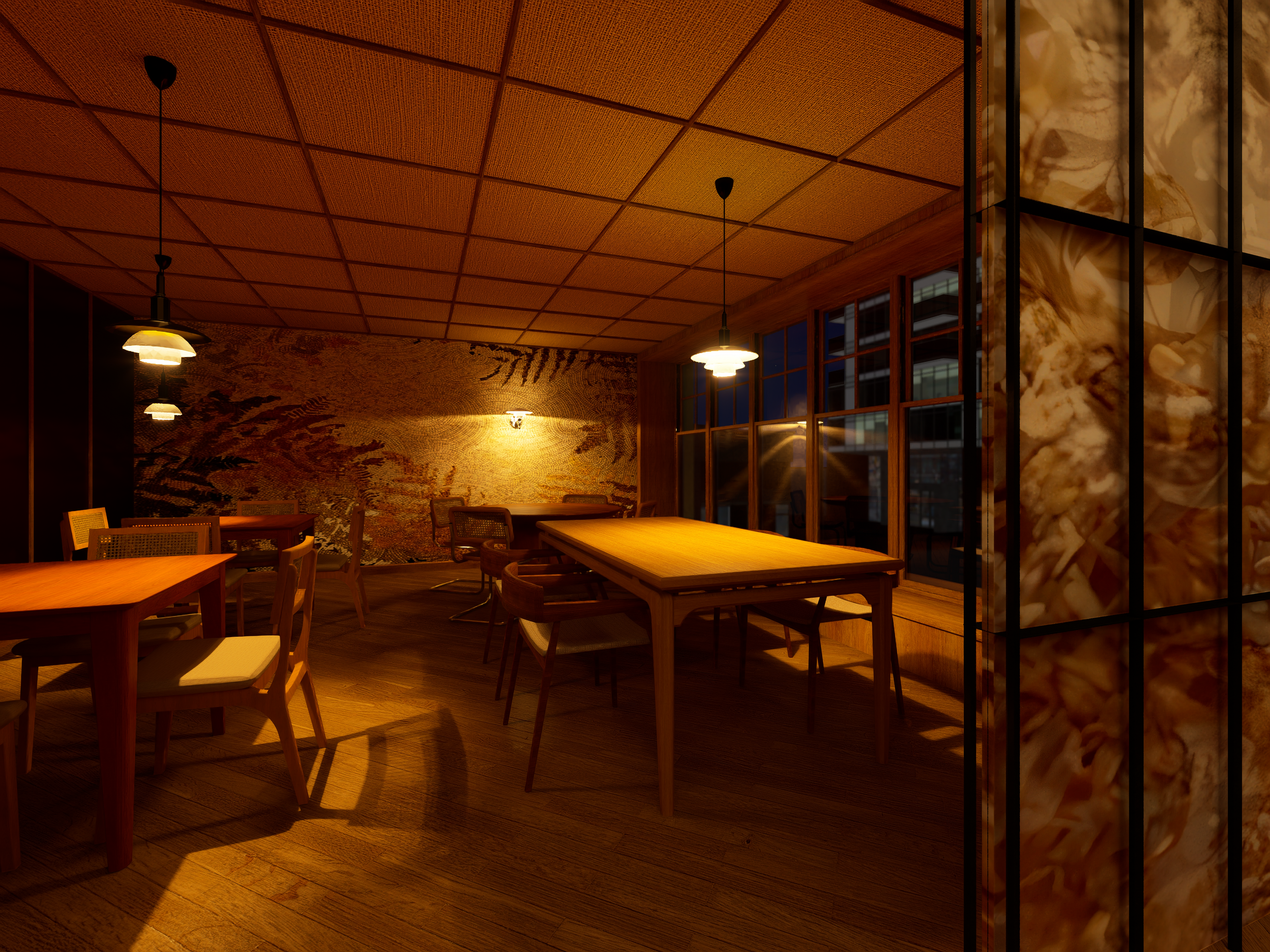
Restaurant dining space
Once this became clear to me, and I was convinced that the restaurant would be a language-driven project, I only needed to decide which language to follow to achieve the desired atmosphere. As mentioned before, Lowly Pal aims to be an ode to the elegance that resides in simplicity, a place to take a break from stimuli and where the spatial layout offers a sense of freedom. At the same time, it seeks to bring warmth, personality, and functionality for both customers and employees.
All of these adjectives and characteristics narrowed down the search for that language that would envelop the restaurant's structure. Ultimately, I chose to adopt a retro-contemporary style, as it embodies everything the restaurant was intended to convey.
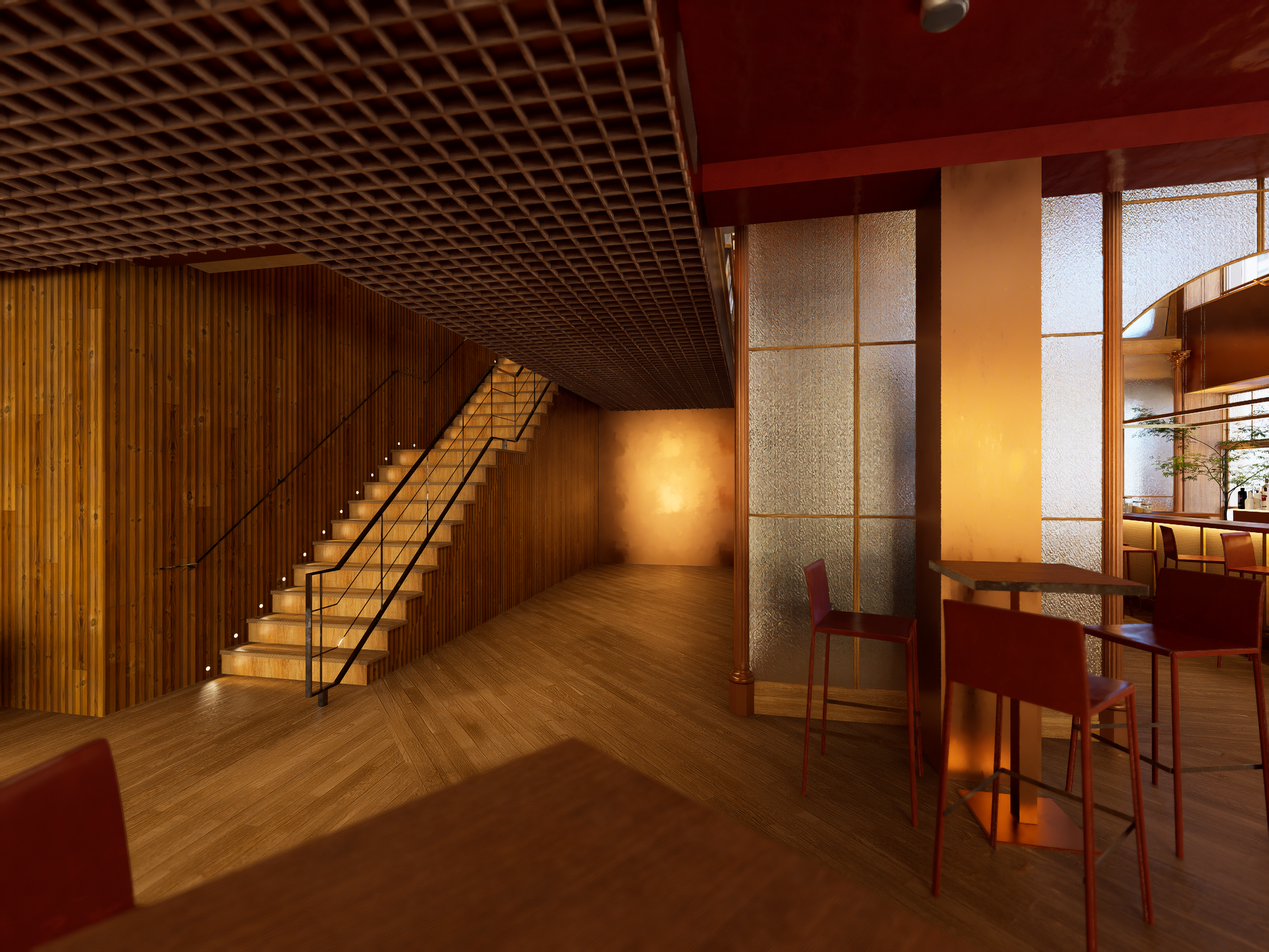
From the very first sketches, I decided to focus on what I considered one of the most significant architectural elements of the space: the double-height ceiling. Drawing from my background in the bartending world and driven by personal passion, I wanted the cocktail bar to be the centerpiece of the restaurant, and therefore, to be positioned within this high-ceilinged space.
Even without knowing the exact location of this double-height space, I made the decision to apply its verticality as a spatial and decorative nod throughout the rest of the restaurant. To achieve this, the square was chosen as a module whose size would dictate not only heights but also the distinction between spaces.
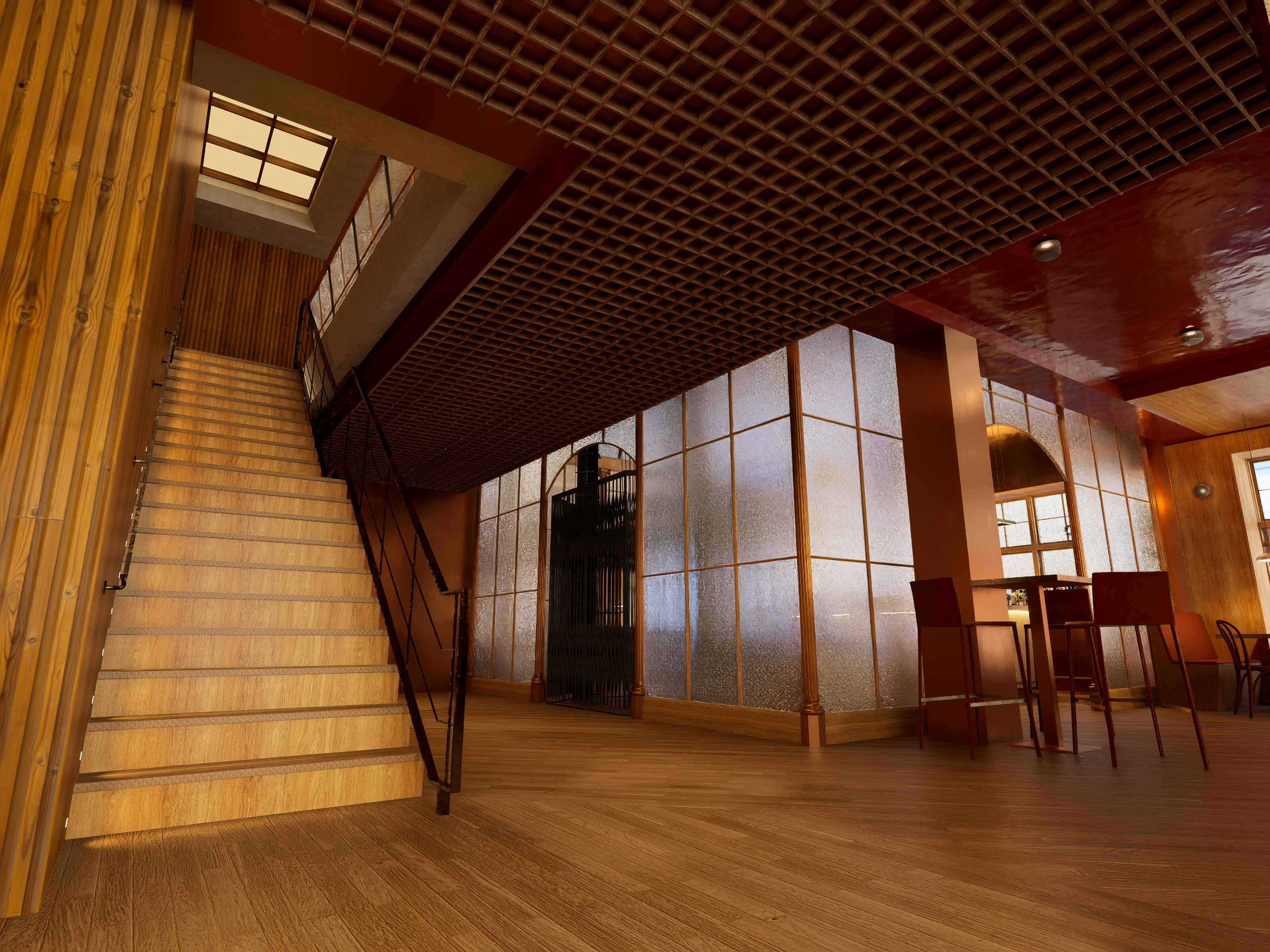
Ground floor hall
Another aspect that I knew had to be key to this venue was natural lighting. The intended atmosphere is warm, relaxed, and open or free; to achieve this, daylighting must play a major role. Since the main facade faces north and the other faces east, and given that the restaurant is located at street level and surrounded by other buildings, sunlight will always be indirect and naturally filtered.
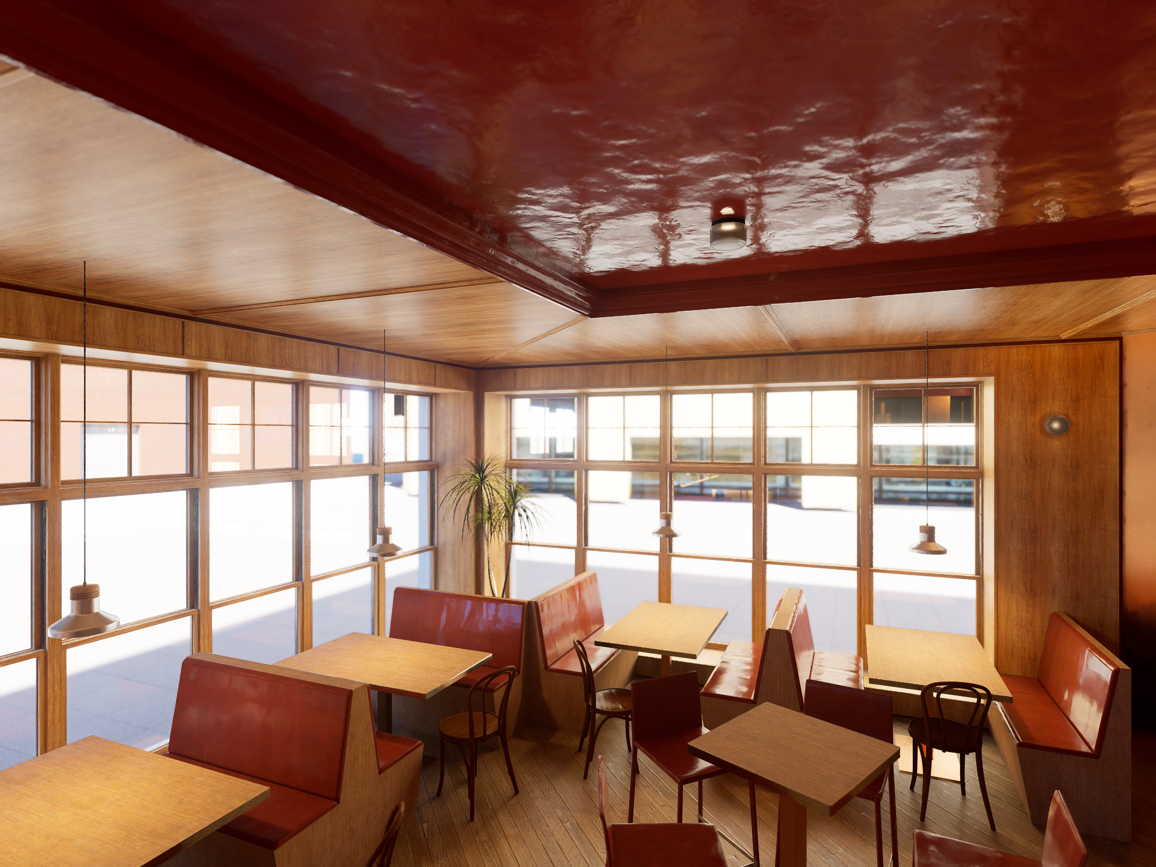
Cocktail bar dining space
For this reason, the goal was always to maximize its penetration into the space and enhance it as much as possible. To achieve this, materials were selected throughout the project to reflect the incoming light through the large windows in a soft and pleasant way. As for the windows, the frames repeat the square module that shapes the space, and they remain completely free of curtains or any elements that could block the sunlight.
Once I was given the layout and section of the space, the next step was to conduct a spatial analysis. The goal was to discover the most efficient circulation paths, the possibilities for locating service areas, the positions of the service shafts, how the interior connects with the exterior, how both levels relate to each other, and, of course, the total available square footage.
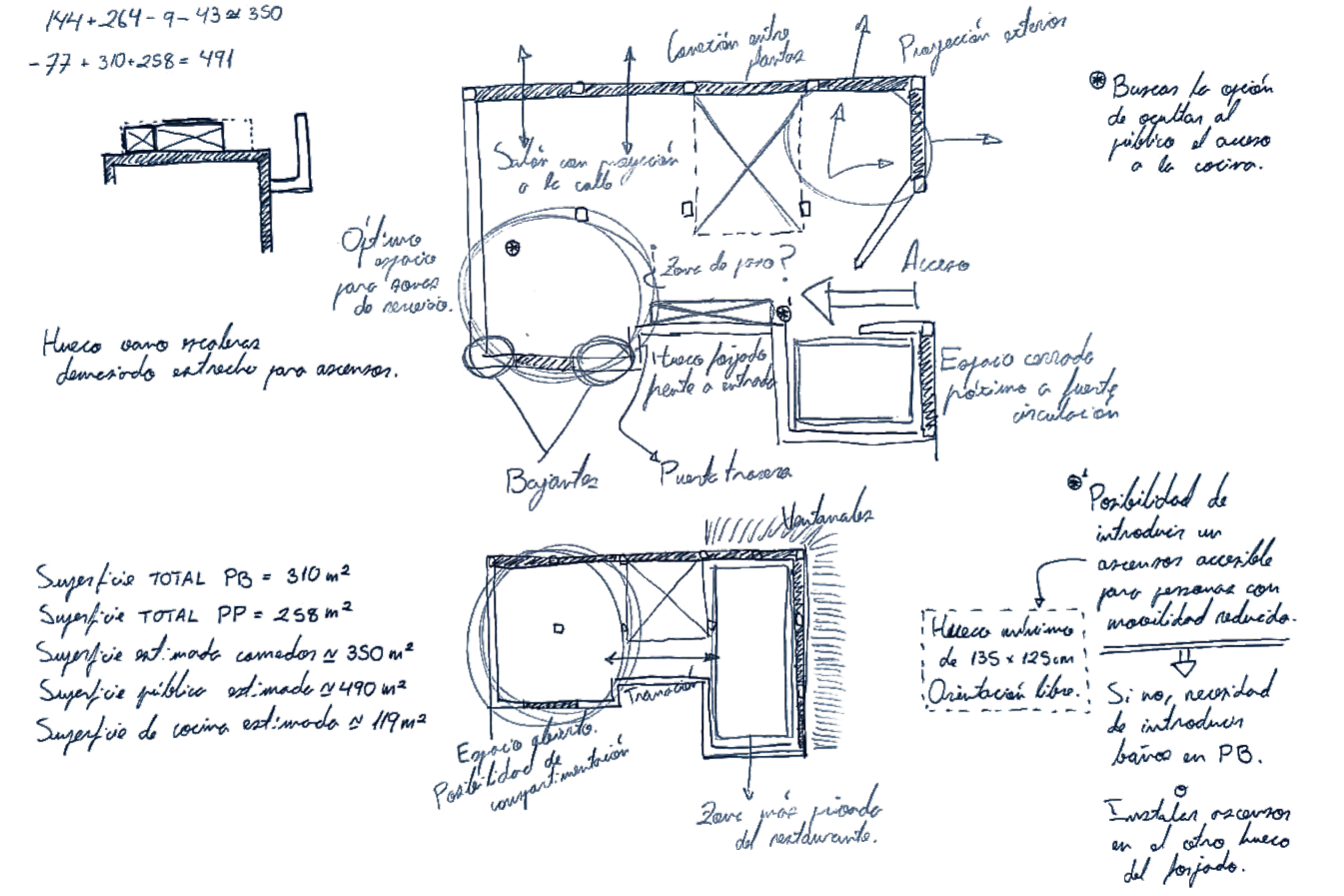
Following this comprehensive analysis, three crucial decisions were made.
The first was to intervene as little as possible in the building's structure, as long as regulations do not require any intervention. Only through spatial honesty can a language-driven project be truly respectful of the architecture.
The second key decision was to create a restaurant that could be fully enjoyed by people with reduced mobility. If the upper level is to be made accessible, the only way is to install an elevator with the required dimensions.
Finally, it was decided to strictly delimit the separation between servant and served spaces. This was designed to foster the aura of simplicity intended for the project. A clear separation between customers and the entire staff area prevents distractions from the experience and generates a more relaxed atmosphere for diners.
All of this is possible because the venue features a back entrance that can be used for staff access, meaning that all of these servant spaces must be located adjacent to this entryway.
Foyer
Ground floor hall
First floor hall
When distributing these spaces, a series of constraints had to be taken into account:
By regulation, hospitality venues spanning two floors must feature a staff staircase and one or more dumbwaiters.
The restaurant offers a fine dining experience, meaning both the kitchen and storage areas must be equipped accordingly.
The more comfortably the staff can work and the more consideration given to workspace design, the better and more fluid the service will be. This especially impacts the kitchen and the efficient circulation between it, the dishwashing area, and the front-of-house staff.
As a luxury restaurant, the headcount is significantly larger to guarantee the cleanest, most efficient, and seamless service possible.
Since the restaurant offers nightlife entertainment on the ground floor, the number of employees is also higher to cover all shifts.
The separation between servant and served spaces must be as absolute as possible, both visually and acoustically, while still maintaining efficient circulation for the front-of-house staff.
Having previously worked in the hospitality industry, one of my main takeaways was that you can never have too much space within service areas.
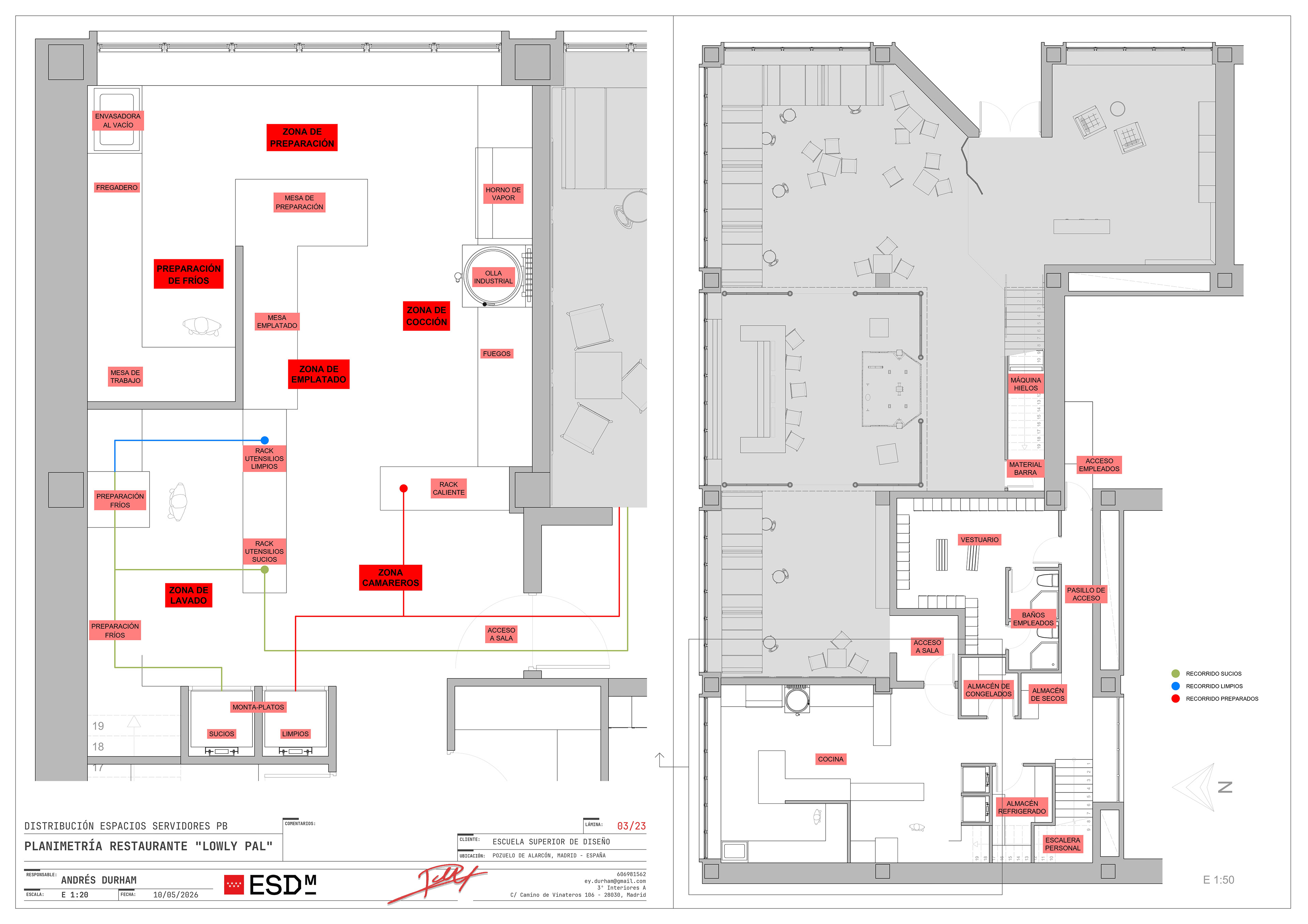
Ground floor servant spaces layout
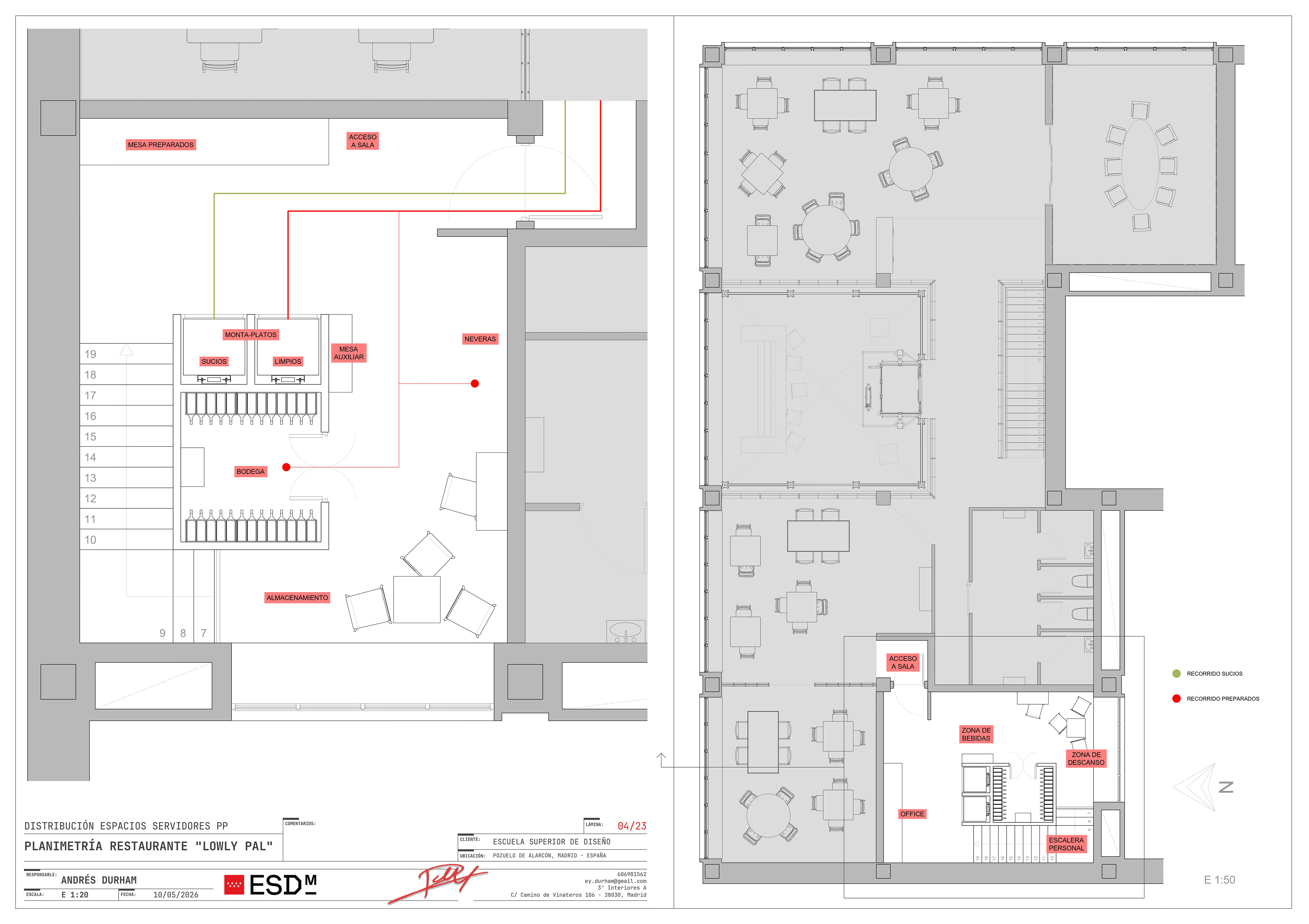
First floor servant spaces layout
Foyer
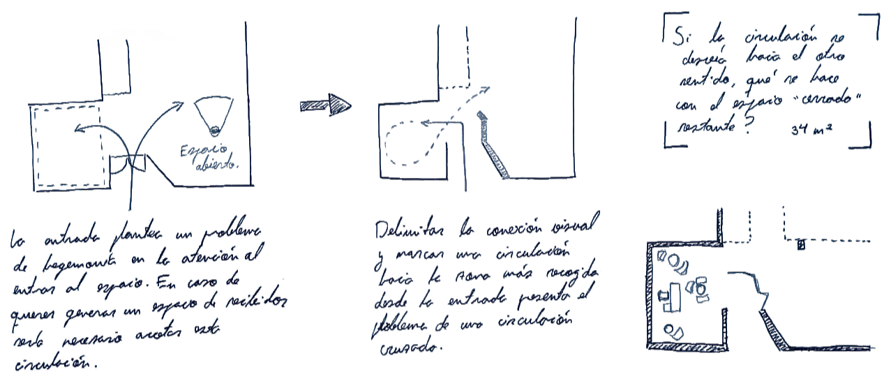
Keeping the original structure of the venue intact meant maintaining the main entrance, which posed a challenge.
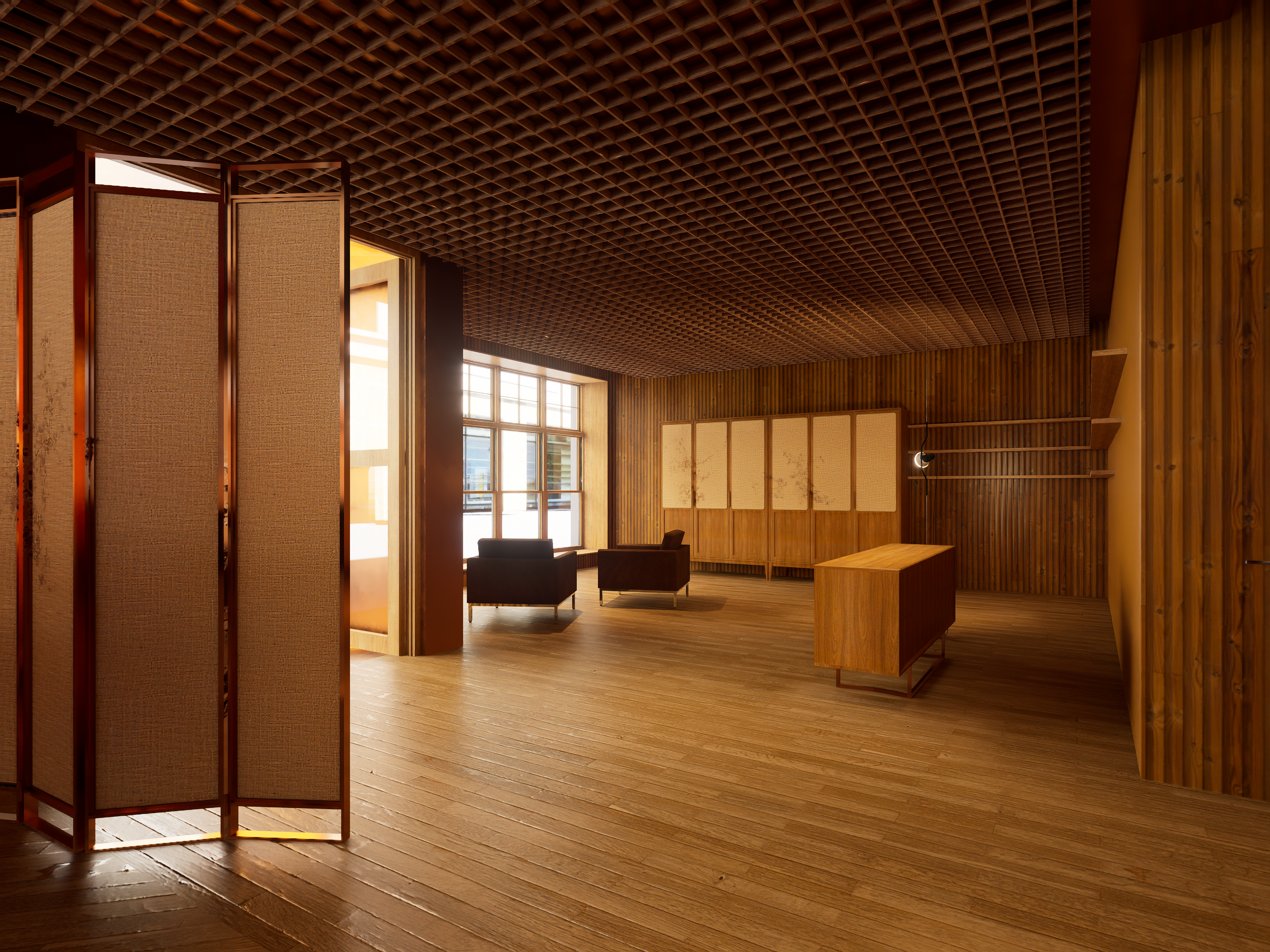
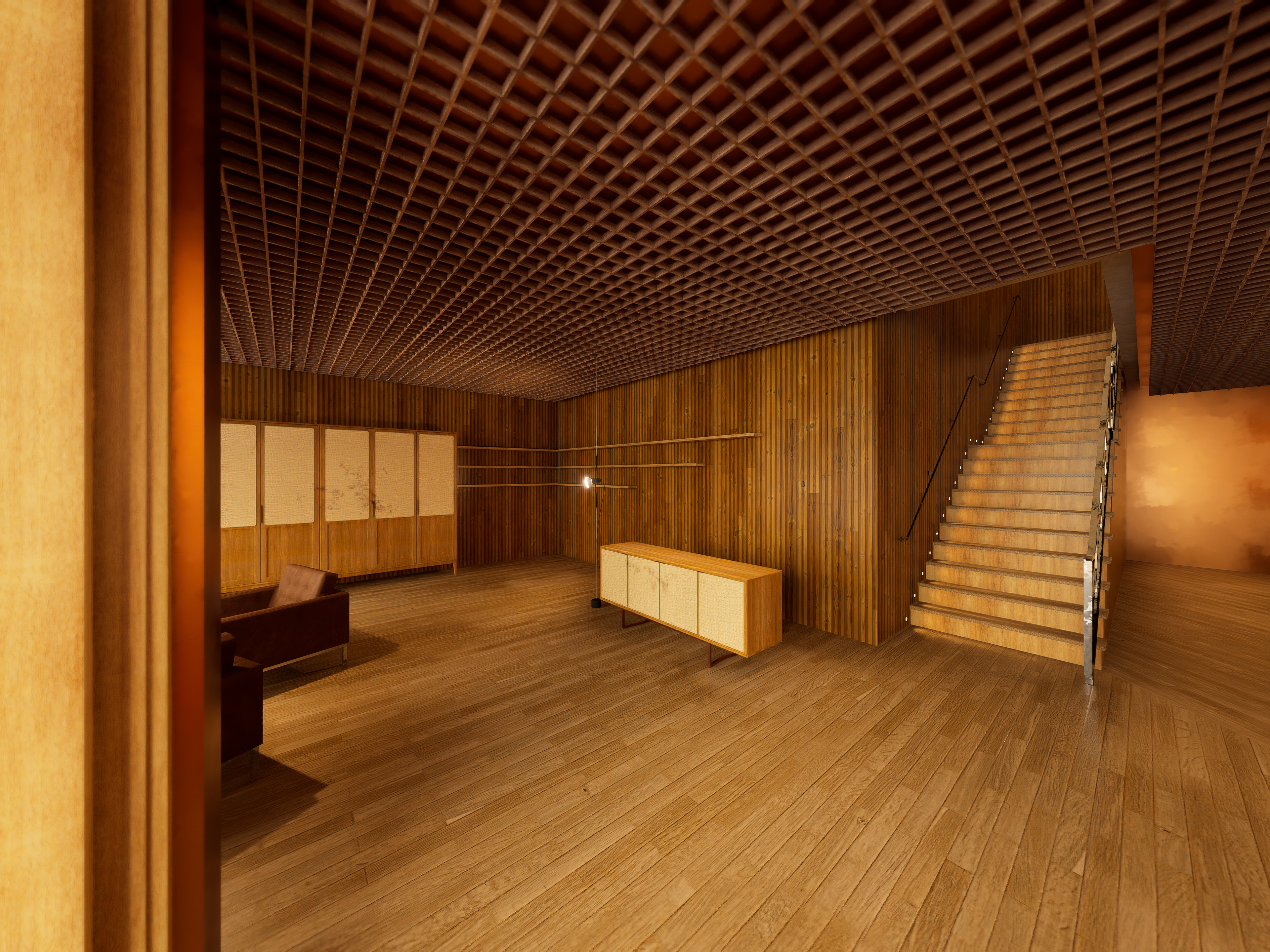
Ultimately, this space was designated as a grand foyer designed to convey luxury through its volume from the very first moment. It features a reception desk, a series of closets to store guests' coats and a small waiting area for customers who prefer not to wait for their table at the cocktail bar.
The remaining area of the restaurant was to be distributed into dining spaces. Looking at the floor plans, it is evident that this entire area is divided into different square-shaped dining rooms, presenting an opportunity to create distinct atmospheres or use cases for each. To decide how to design each of these rooms, a new spatial analysis was conducted, this time factoring in the boundaries of the servant spaces.
Positioning the cocktail bar within that central double-height space, flanked by two dining rooms, immediately led to the decision to split the restaurant into two distinct culinary concepts based on the floor level.
The ground floor offers a casual, vibrant atmosphere more focused on premium beverages and upscale snacks during the day, transitioning into nightlife entertainment after dark.
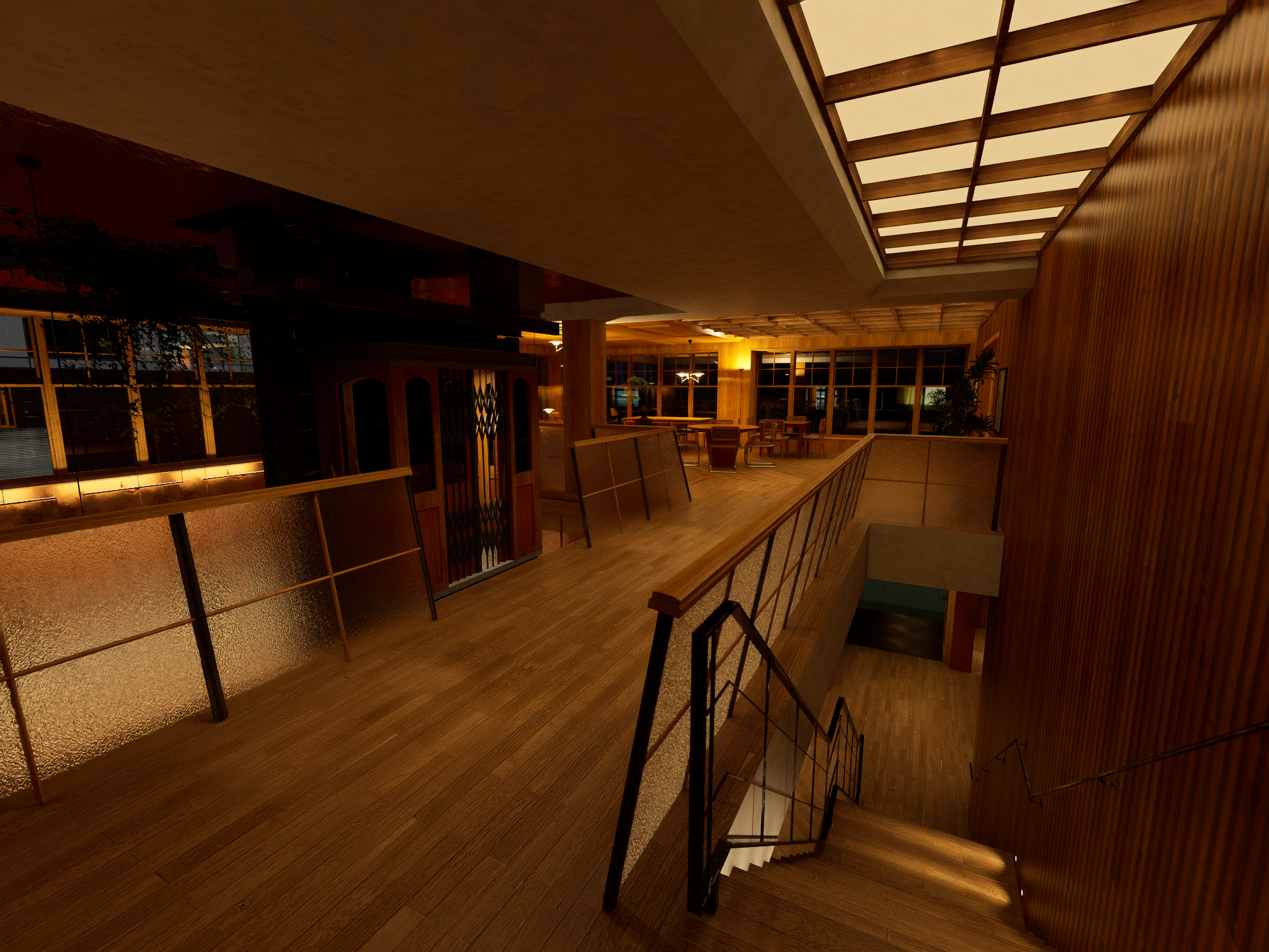
The first floor is envisioned as a traditional fine dining restaurant featuring different rooms and atmospheres, all centered around a Northern European gastronomic concept.
In terms of decoration and furniture layout, all of these spaces are designed to draw the eye toward the central double-height void, the true axis of the restaurant's volumetric structure.
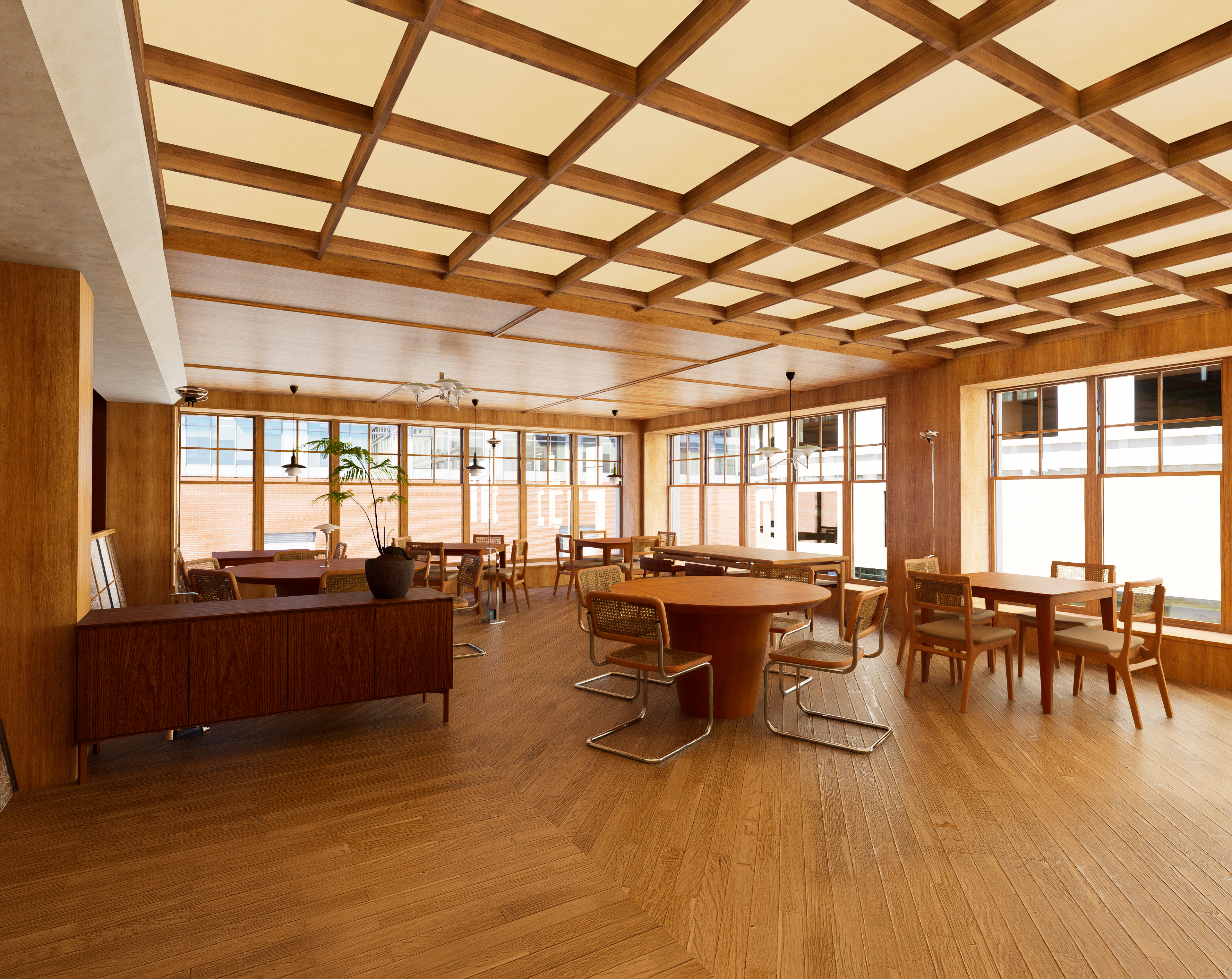
Restaurant dining space
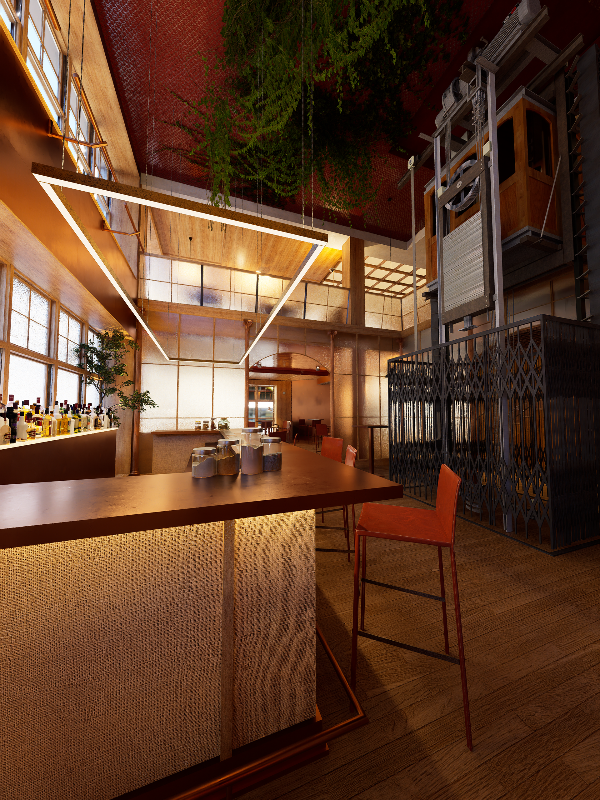
Cocktail bar
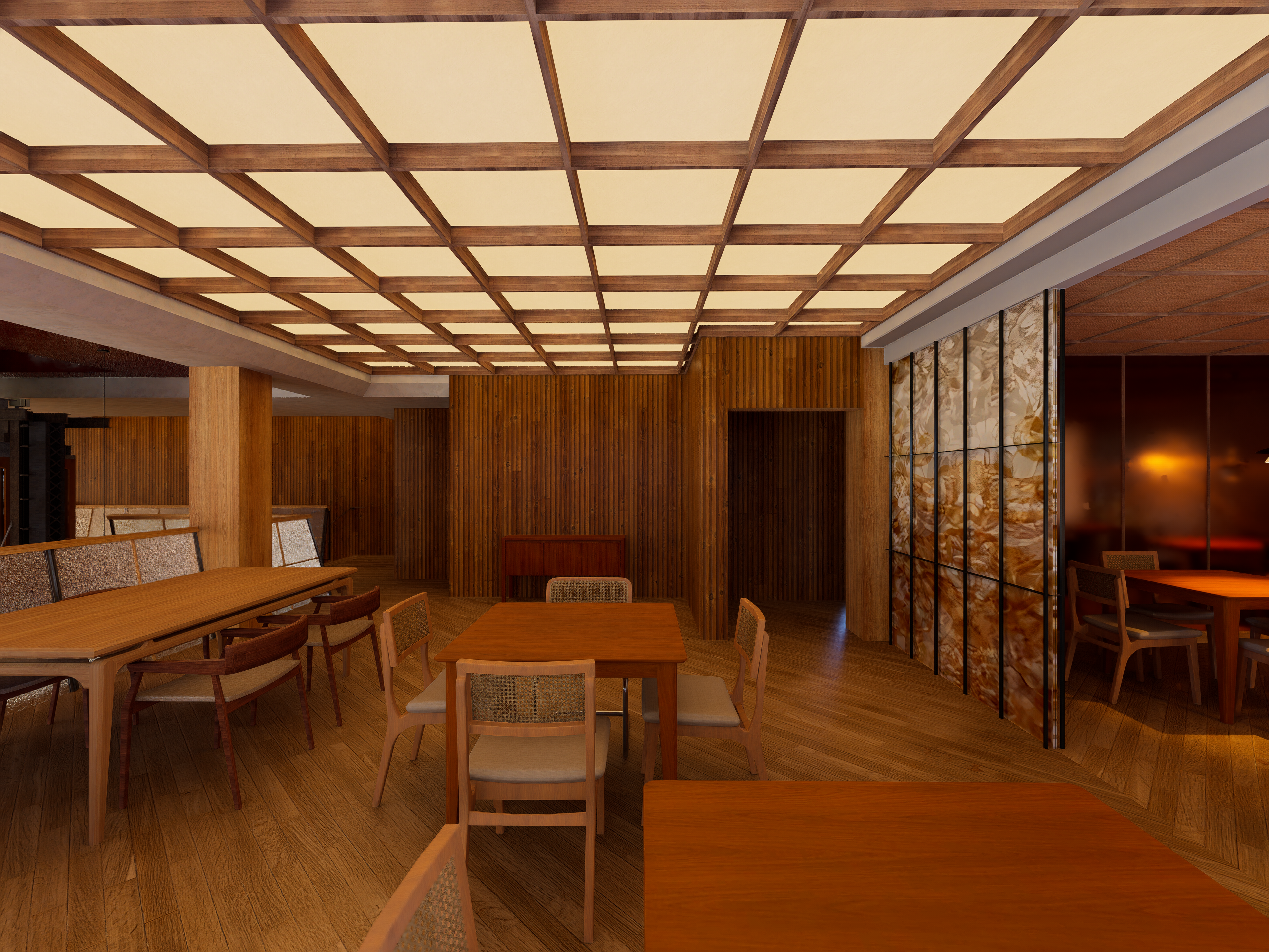
Restaurant dining space
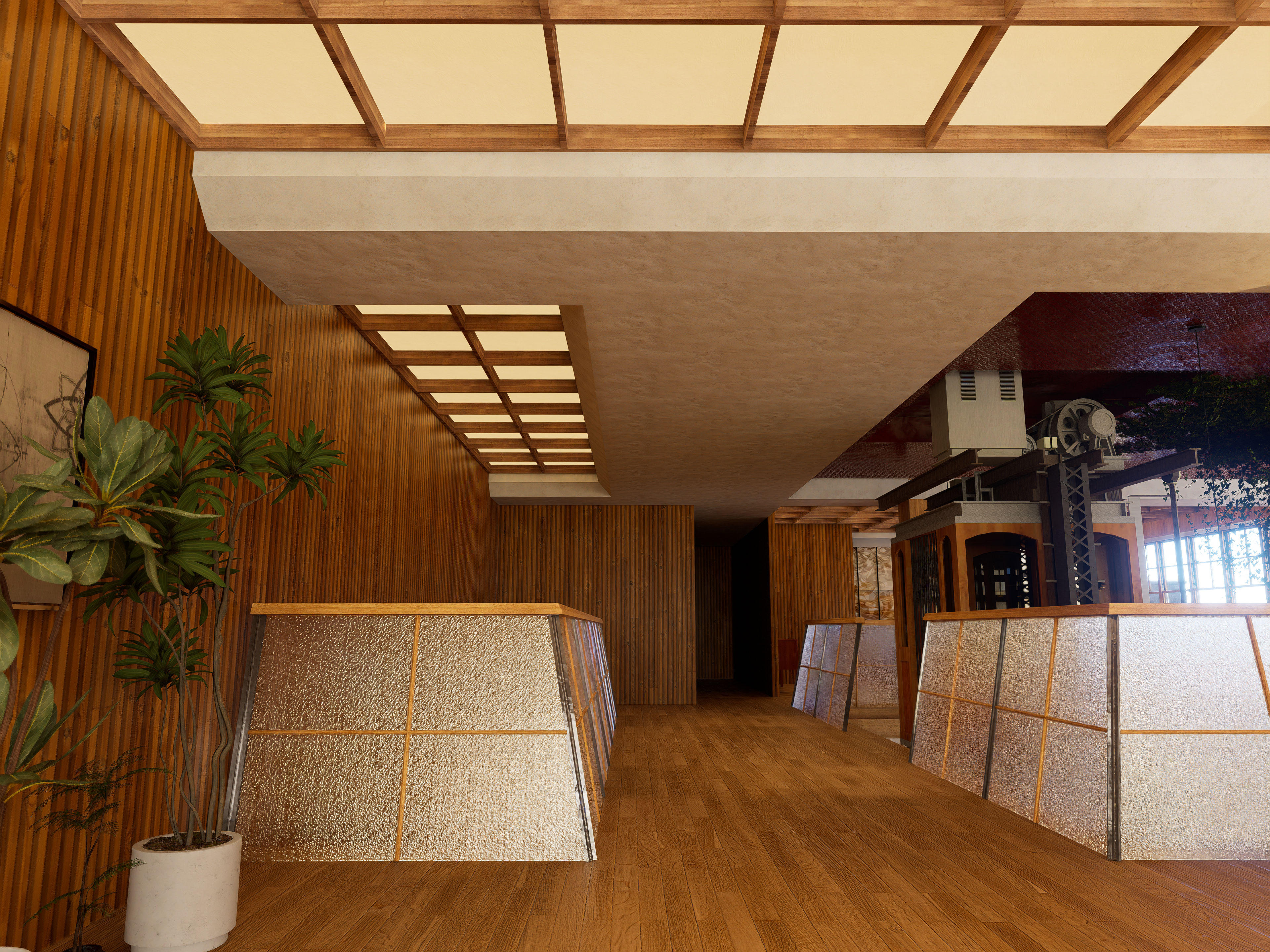
First floor hall
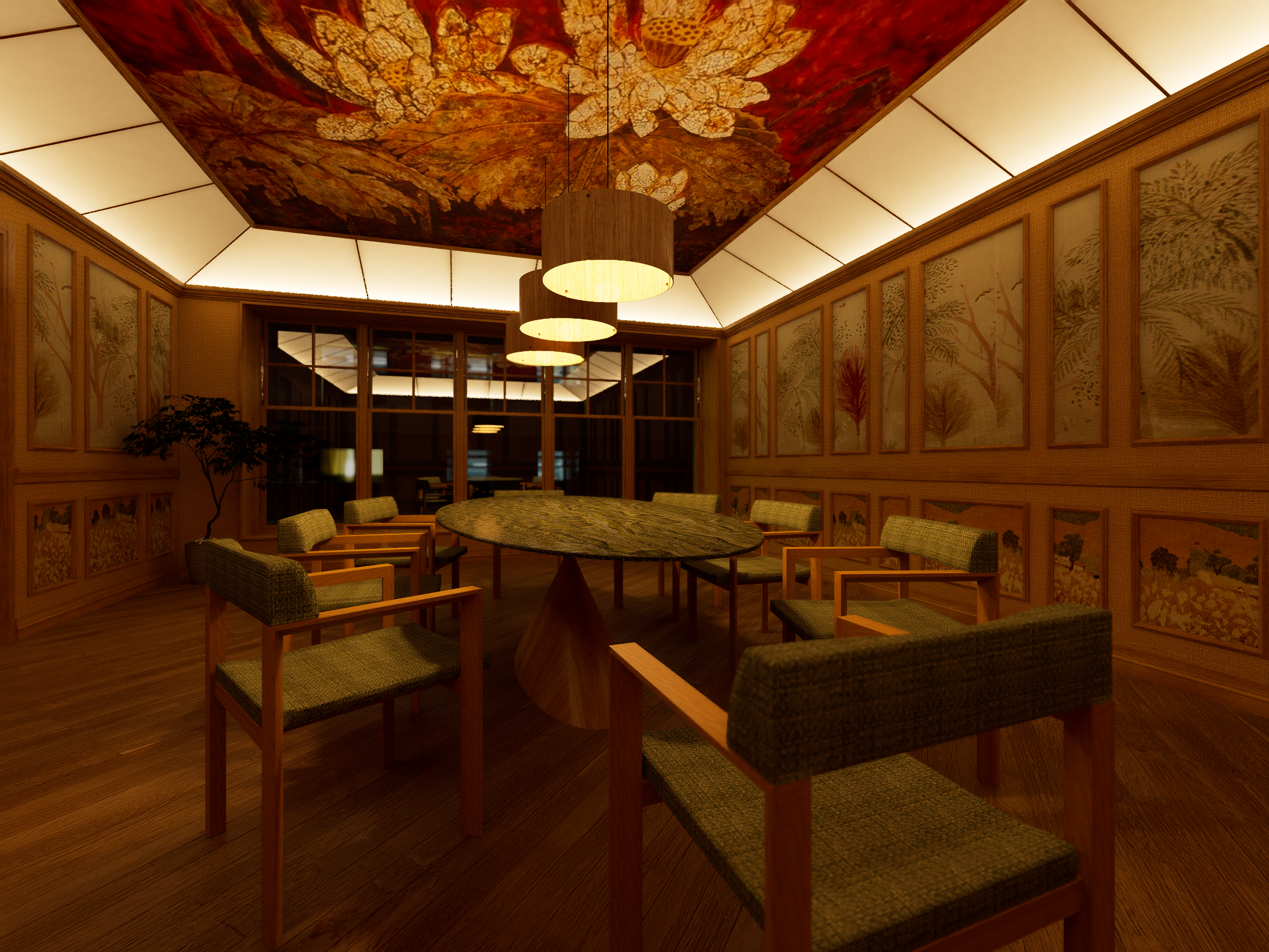
Private dining room
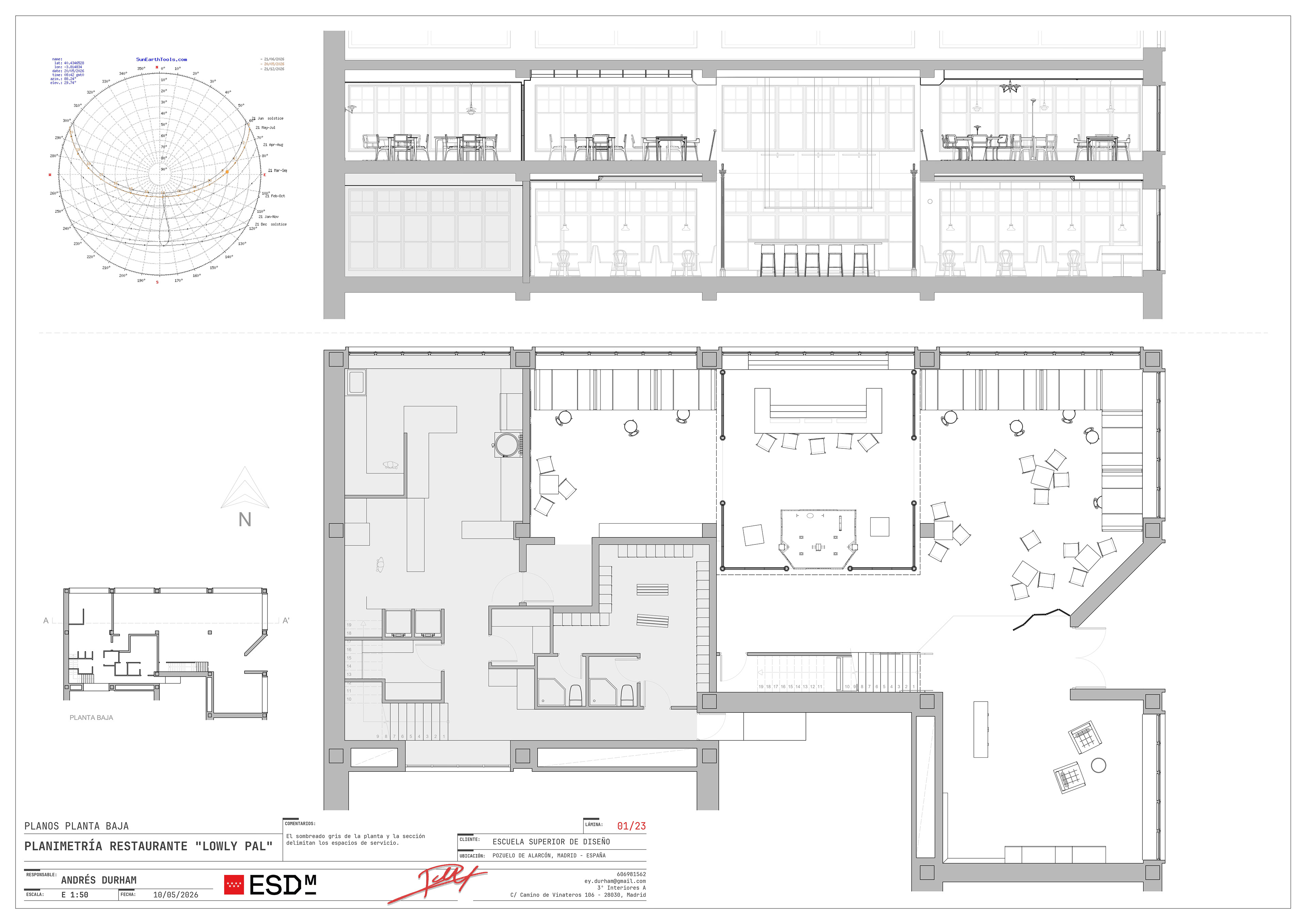
Ground floor drafting
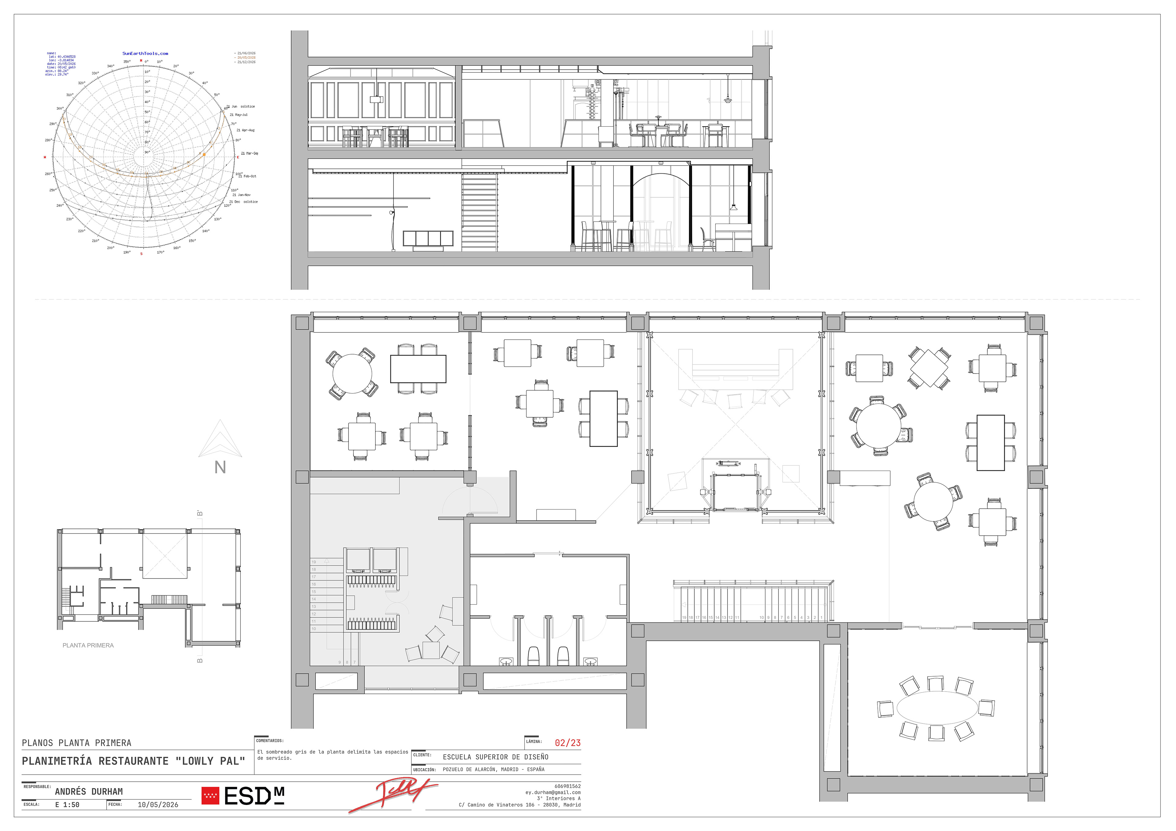
First floor drafting
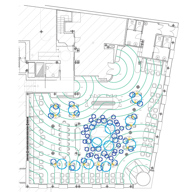
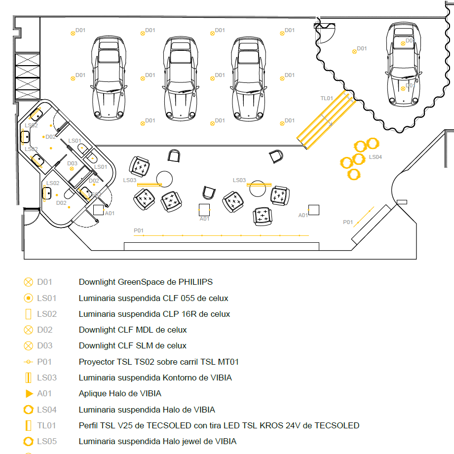
Once the project's conceptualization was complete and all formal decisions were made, the technical installations were integrated. To ensure they fit seamlessly into the venue's layout and maintained visual harmony, they were factored in from the very beginning of the design process.
All sketches, technical data sheets, and drafting work can be found in the following documents (in Spanish because my studies took place in Spain).